Home » PSApedia
Data visualization effectiveness
Harness the Power of Data Visualization Effectiveness. Transform Complex Information into Clear Insights.
What is Data Visualization Effectiveness?
Data visualization is the graphical representation of information and data. By using visual elements like charts, graphs, and maps, data visualization tools provide an accessible way to see and understand trends, outliers, and patterns in data.
In the context of Professional Service Automation (PSA), data visualization aids in making data-driven decisions, understanding project progress, and analyzing financial metrics.
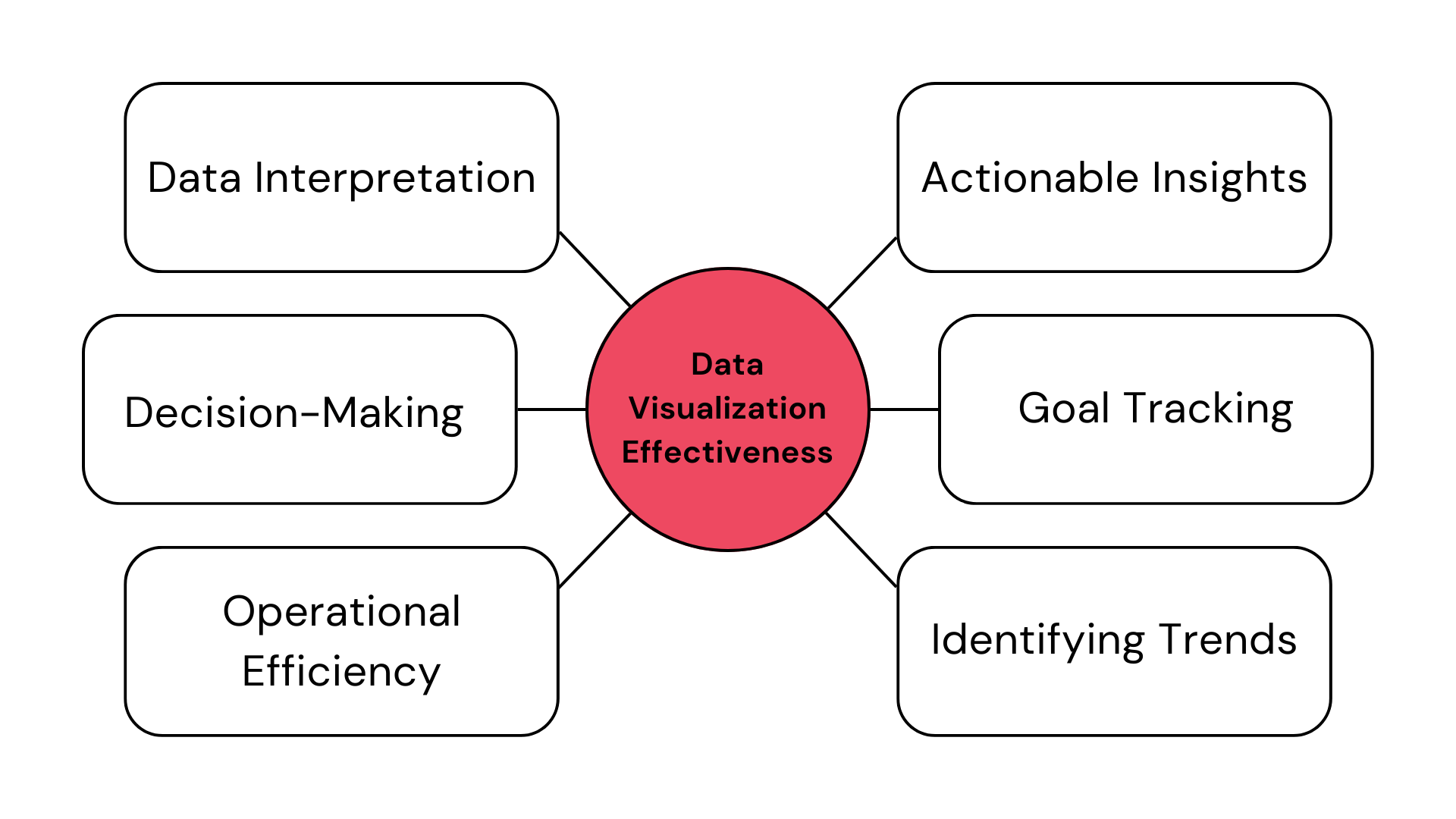
Importance of Data Visualization in PSA
In PSA, where numerous projects run simultaneously, understanding data at a glance is crucial. Here’s why:
1. Quick Decision Making: Visual data allows managers to make quick, informed decisions without sifting through raw data.
2. Identify Trends: With tools like Gantt charts, teams can identify project timelines and potential bottlenecks.
3. Financial Analysis: Financial management becomes more straightforward when visualized. It’s easier to spot anomalies or areas for improvement.
4. Resource Allocation: Resource management software often uses visual aids to help allocate resources efficiently, ensuring no team member is overburdened.
Importance of Data Visualization in PSA
Calculating Data Visualization Effectiveness
Formula:
Effectiveness = (Number of Insights Gained /Time Spent) × Usability Score
Example: If a manager spends 10 minutes on a dashboard and gains 5 insights with a usability score of 0.8 (on a scale of 0 to 1), the effectiveness is:
Effectiveness=(5/10)×0.8=0.4
This means the dashboard has a moderate effectiveness score.
Data Visualization vs Other Visualization Techniques
While data visualization focuses on representing data graphically, other techniques might focus on process visualization or abstract concepts. For instance, while a sales pipeline might visualize the sales process, it doesn’t always represent quantitative data. Similarly, a proposal builder visualizes a sales proposal’s structure but not necessarily data trends.
| Aspect | Data Visualization | Other Visualization Techniques |
|---|---|---|
| Purpose | Helps analyze and present data to gain insights and make informed decisions related to PSA operations. | Primarily used for presenting non-data information, such as project timelines, organizational structures, and process flows. |
| Data Representation | Presents data in various visual formats like charts, graphs, maps, and dashboards, making complex data more understandable. | Represents information through diagrams, flowcharts, org charts, Gantt charts, and other graphical or textual formats. |
| Interactivity | Often interactive, allowing users to explore data, filter, and drill down to extract specific insights. | Typically offers limited interactivity, focusing on displaying static information or process flows. |
| Insight Generation | Aids in discovering trends, patterns, and anomalies within PSA data, which can inform better resource allocation, project management, and decision-making. | Supports the understanding of processes, project workflows, and organizational structures rather than in-depth data analysis. |
How Data Visualization is Used in PSA?
Data visualization streamlines project management and resource allocation by presenting complex data in a comprehensible format. It helps teams monitor project progress, resource utilization, and financial metrics through intuitive charts and graphs, enabling quicker decision-making and more effective allocation of resources for optimal project performance.
1. Project Tracking: Tools like Gantt charts and project management software allow teams to track progress visually.
2. Financial Reporting: Finance management software uses graphs and charts to represent financial data, making it easier to understand.
3. Resource Allocation: Visual tools in resource management software help allocate resources efficiently.
4. Deal Management: Visualizing deal stages helps sales teams understand where each potential deal stands.
Ready to Optimize Your Data Visualization?
KEBS, a leading PSA software, offers a plethora of tools to optimize data visualization. Tailor-made dashboards to suit your organization’s needs, ensuring data is presented most effectively.
KEBS allows for two-way data sync, ensuring your visualizations are always up-to-date. With custom reporting, dive deep into your data and gain insights that generic reports might miss. KEBS ensures that data isn’t just visualized but is also easy to understand, enhancing decision-making.
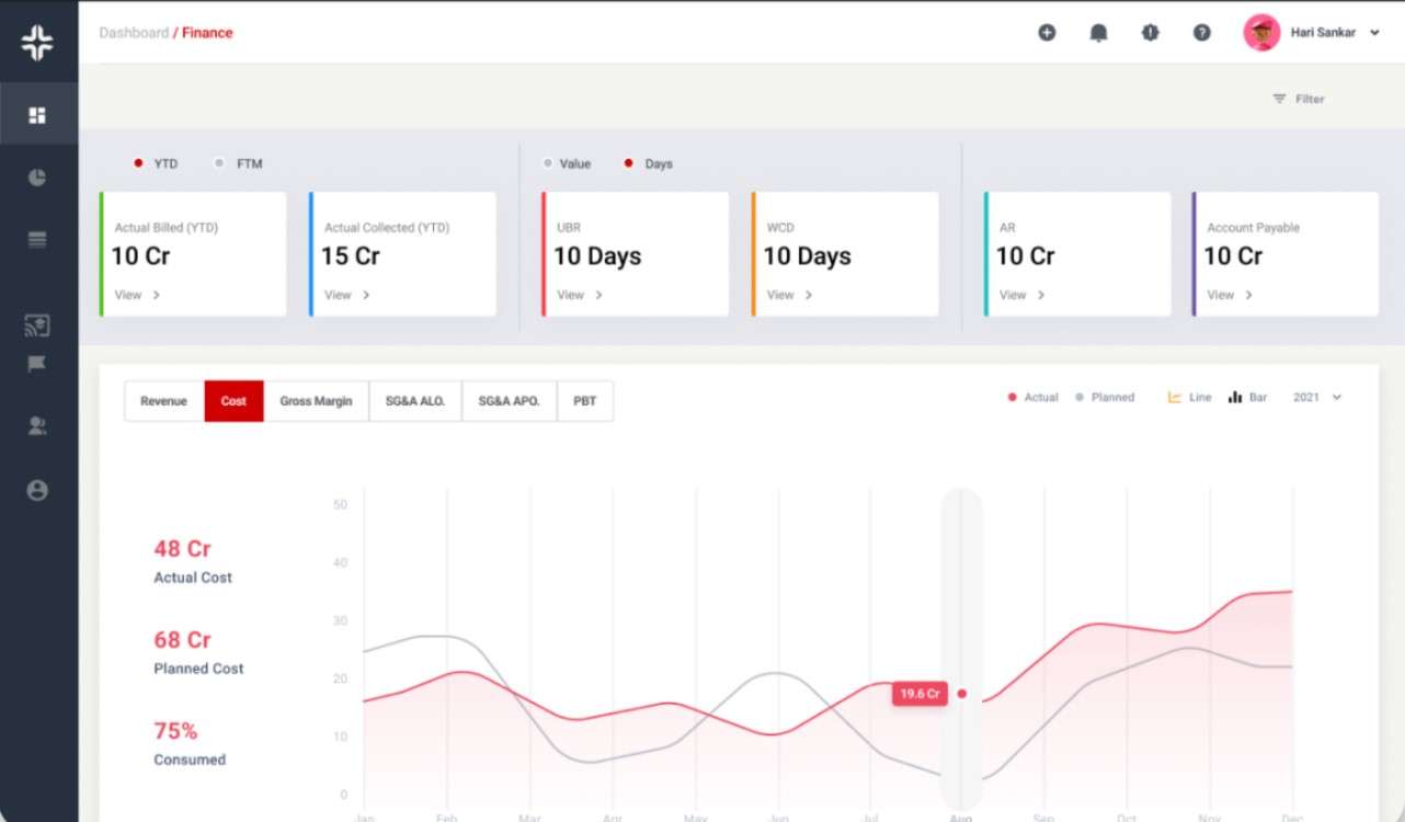
KEBS Finance Management
Ready to leverage the power of data visualization in your PSA processes? Contact us today or request a demo to see KEBS in action.